Brandguidelines
These guidelines were created to inspire you in designing products, messages and graphic expressions for Metosin that follow our strategy and values.

Essence
The Essence of Metosin
We are a house full of uncompromising talent that works hard to deliver results and shares a love for problems and never-ending learning. We collaborate with disruptors and game-changers and believe in unconventional solutions and honesty – even when it means more work for us.
-
Values
Honesty
Integrity
Respect: the client has the right to be wrong
Expertise and a constant hunger to learn more -
Brand Personality
Brave
Expert
Easily approachable
Easygoing
Exclusive: our services are targeted to a narrower focus group -
Company Goals
Selling holistic projects instead of tasks
Perfecting expertise
Fostering long and rewarding client relationships

Identity
Verbal Identity
We speak in a matter-of-fact, yet friendly manner. We are experts but we don’t take ourselves too seriously. When we speak and write, we convey trustworthiness and bravery. We never polish truths or sell myths.
-
Approach
Professionalism
Expertise
Deep knowledge
Big thinking -
Tone of Voice
Matter-of-fact
Reliable
Witty
Honest
Confident -
Anchoring themes
Problem(-solving)
Talking
Honesty
Relaxedness
Verbal Identity
Core copy
-
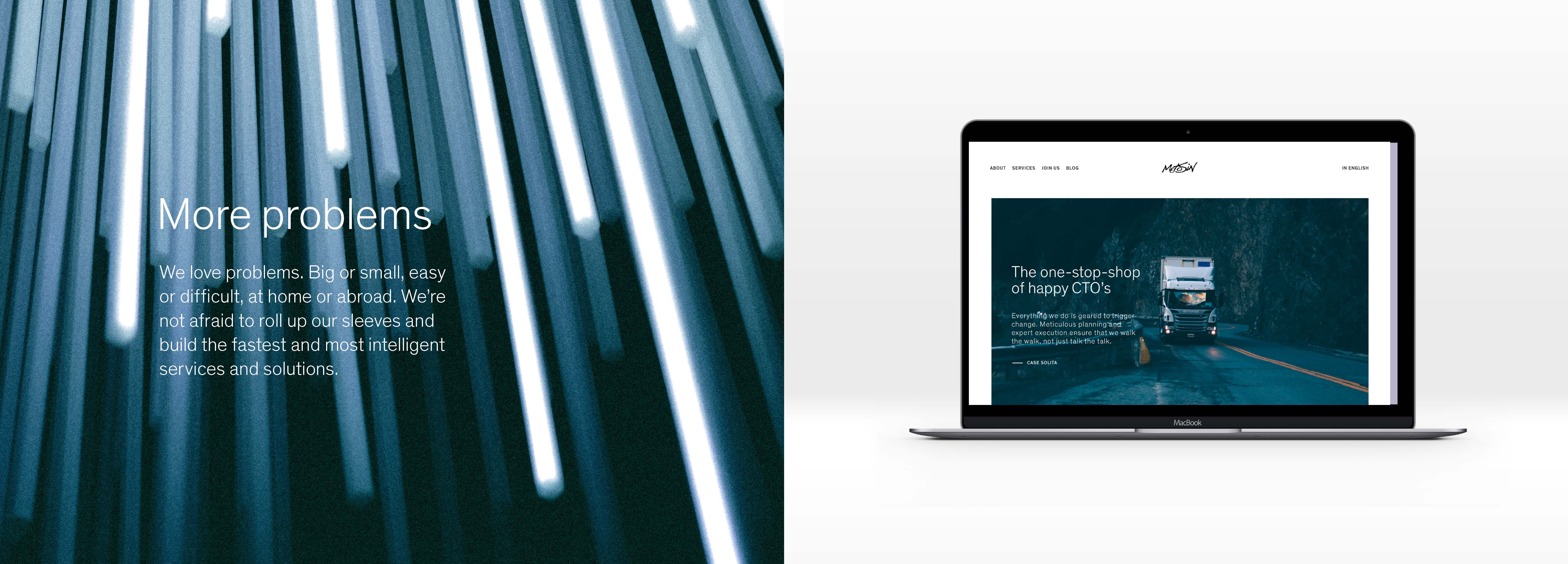
More problems
We love problems. Big or small, easy or difficult, at home or abroad. We’re not afraid to roll up our sleeves and build the fastest and most intelligent services and solutions.
-
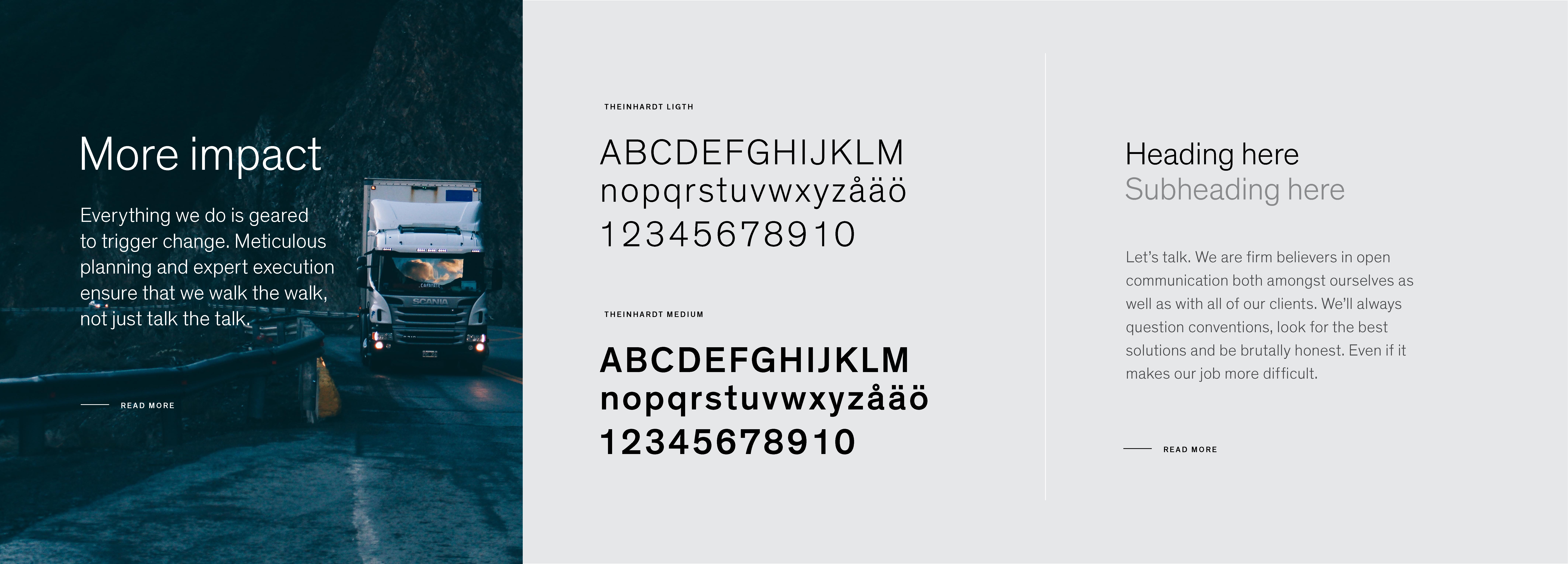
More impact
Everything we do is geared to trigger change. Meticulous planning and expert execution ensure that we walk the walk, not just talk the talk.
-
More talk
Let’s talk. We are firm believers in open communication both amongst ourselves as well as with all of our clients. We’ll always question conventions, look for the best solutions and be brutally honest. Even if it makes our job more difficult.
-
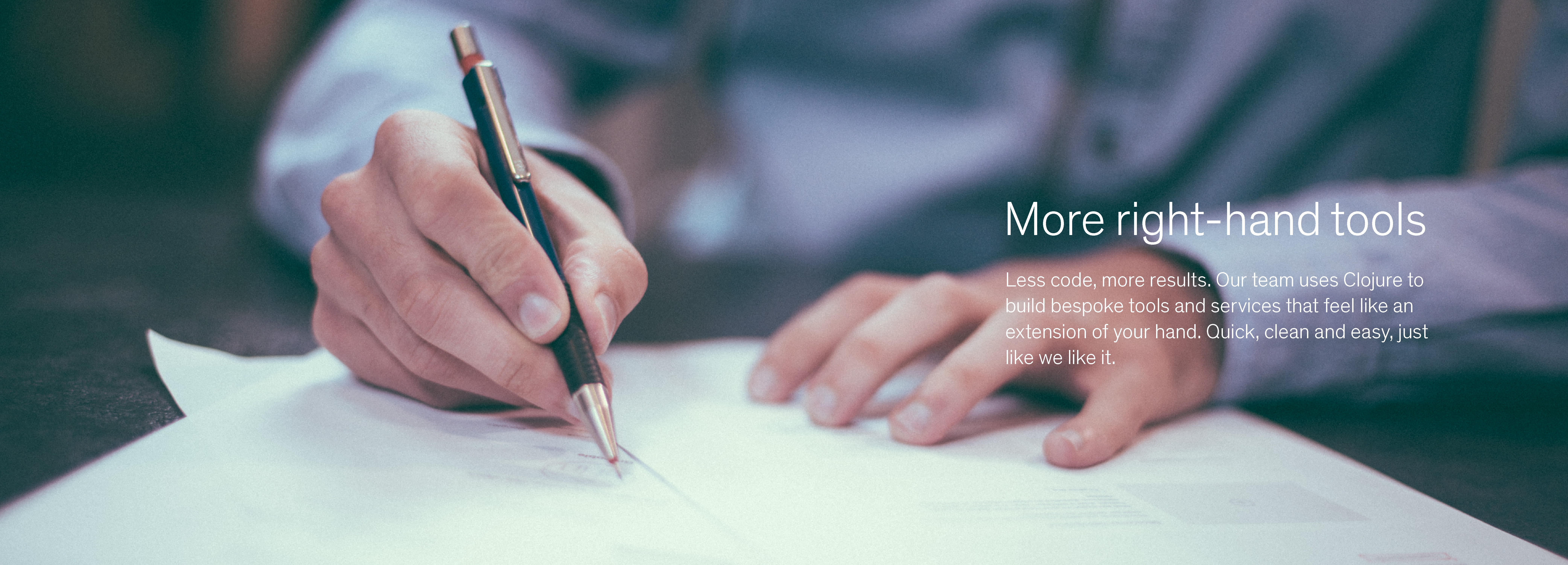
More right-hand tools
Less code, more results. Our team uses Clojure to build bespoke tools and services that feel like an extension of your hand. Quick, clean and easy, just like we like it.
-
More solutions
Nobody does it like us. Armed with a team of hand-picked talent, we make sure that we deliver – and beyond. Like what you see and feel like you could be a part of our family? We should talk.

Identity
Visual Identity
Metosin's visual expressions are professional, solid, reliable and they convey expertise and deep knowledge. The consistent use of images and restricted use of colors creates a coherent brand expression. We believe that good design is as little design as possible. Whitespace is beautiful. All the visual elements sit tight in the grid. Like any digital service, Metosin's identity is a living, responsive entity that evolves to suit all future needs and media solutions.

Logo
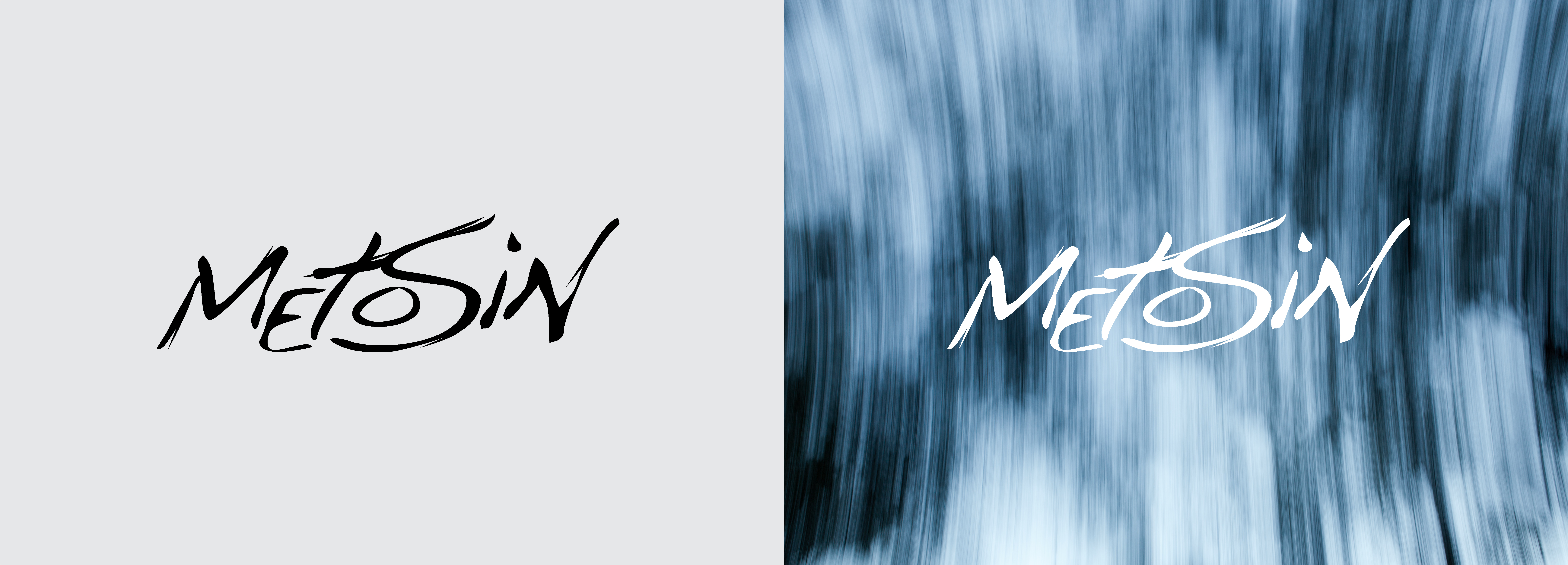
Logo and usage
Use Metosin logotype in all marketing communications. The logotype can be used as either black or white. Give the logo space to breathe by leaving sufficient white space around it. Make sure that the logotype is clearly visible when placed on a colored background or on top of an image.
Avoid all alterations of the logotype. This includes rewriting or replacement of the logotype, usage of other colors than black or white, drop-shadows and other effects. Rotating, skewing or adding any effects to the logo is not allowed. Make sure you have the latest logo files in use when starting a new project by downloading the assets from the link below.
Color
Brand Colors
These are the colors that make us look great. Our color palette consists of cool, wintery shades that are mostly present within the images, leaving the rest of the identity solid black and white. Petrol blue is our primary brand color that can be used subtly for emphasising information. The additional colors are dark blue, pitch black, desert gray, light gray and white.
-
Petrol blue
CMYK 100 0 27 1
PANTONE 3135 U
RGB 0 142 166
HEX #008EA6 -
Dark blue
CMYK 99 18 39 43
PANTONE 3165 U
RGB 47 92 102
HEX #2F5C66 -
Pitch black
CMYK 0 0 0 100
PANTONE Black 6 U
RGB 0 0 0
HEX #000000 -
Desert gray
CMYK7 4 6 14
PANTONE Cool Gray 3 U
RGB 197 197 197
HEX #C5C5C5 -
Light gray
CMYK 4 3 6 7
PANTONE Cool Gray 1 U
RGB 218 217 214
HEX #F5F5F5 -
White
CMYK 0 0 0 0
RGB 255 255 255
HEX #FFFFFF

Typography
Brand Typography
Main font for our graphic expressions, Theinhardt, is a grotesque sans-serif typeface. Theinhardt is to be used in all printed marketing materials, digital advertisements and our website. Theinhardt is a legible font optimized for print, web, and mobile interfaces. Use Theinhardt Light for headings and body text. For highlighting purposes use Medium cut in all caps and with expanded letter spacing. Make the design airy. Use left aligned text placement. Take care of readability as well as clear messaging.
Theinhardt can be bought here: https://www.optimo.ch/typeface...
Our fallback system font Arial is to be used when the usage of Theinhardt is unnecessarily difficult or it is not available such as in internal documents or in a newsletter.
Images
Brand Imagery
The new image style consists of consistent visual world with dramatic images that vary from illustrative tech & business world to more conceptual and abstract pictures with the element of motion.